foo="barley"
foo="lumbar"
foo="embark"
Girl Develop It is here to provide affordable and accessible programs to learn software through mentorship and hands-on instruction.
Some "rules"

Not just classes and ids any more!
div[foo^="bar"] {
  color: red;
}
div[foo$="bar"] {
  background-color: red;
}
div[foo*="bar"] {
  border: solid 5px red;
}People don't actually use foo do they?
a[href^="http://"] {
  color: red;
}
img[src$=".jpg"] {
  border: solid 5px red;
}
Say WHAT???
Ever want to style a table so that every other row was a different color?
Or have a gallery of images so that each row is 3 images wide?
:nth-child pseudo-class is used to style every 2nd, 3rd, 4th, or "nth" element
matches an element that has position an+b
element:nth-child(an + b) { style properties }
tbody tr:nth-child(an + b) { backround-color: red; }
| n | 2n+1 | 4n+1 | 4n+4 | 4n | 5n-2 | -n+3 |
|---|---|---|---|---|---|---|
| 0 | 1 | 1 | 4 | - | - | 3 |
| 1 | 3 | 5 | 8 | 4 | 3 | 2 |
| 2 | 5 | 9 | 12 | 8 | 8 | 1 |
| 3 | 7 | 13 | 16 | 12 | 13 | - |
| 4 | 9 | 17 | 20 | 16 | 18 | - |
| 5 | 11 | 21 | 24 | 20 | 23 | - |
You can style form elements that are disabled and enabled
input:enabled { background-color: green; }

input:disabled { background-color: grey; }
You can style checkboxes and radio buttons when they are selected
input:checked + label {
  color: red;
}
Enhance our Women in Computing web site to use HTML5 & CSS3
We need to clear every 4th famous woman
Previously, this was done by manually adding a break class to every 4th element
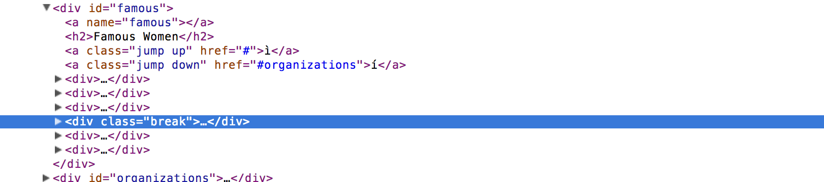
Replace this with an :nth-child selector
Make the rows of women three long
#famous article:nth-child(4n) {
  clear: both;
}
#famous div:nth-child(4n) {
  clear: both;
}
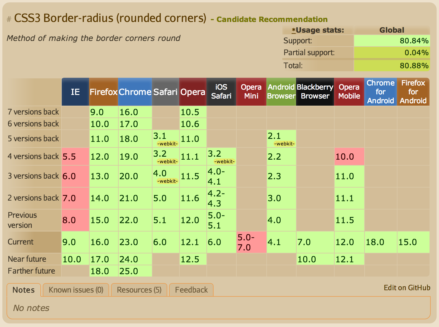
HTML5 and CSS3 are still new!
This is great, but it means that not all browsers treat new CSS3 properties the same
.example{
  -moz-property: value;
  -ms-property: value;
  -webkit-property: value;
  -o-property: value;
  property: value;
}
the non-prefixed property should always go last
Allows you to create rounded corners
#example1 { border-radius: 20px; }
#example2 { border-radius: 10px 40px; }
#example3 { border-radius: 10px 20px 40px 80px; }#example4, #example5 {
border-radius: 50%;
}Creates an ellipse
Creates a circle if height == width
Remember vendor prefixes? This is where we would use one
#example1 {
  -webkit-border-radius: 20px;
  -moz-border-radius: 20px;
  border-radius: 20px;
}
In CSS, we can choose colors with hexadecimal #00ff00 or rgb(0, 255, 0)
In CSS3, there are ways to control opacity of a color too!
control the opacity of a color
.example2.rgba {
  background-color: rgba(255, 0, 0, 0.8);
}
color property using (red, green, blue, opacity)
opacity is a decimal value from 0 to 1
control the opacity of an element
.example2.opacity {
  opacity: 0.8;
}
decimal value from 0 to 1
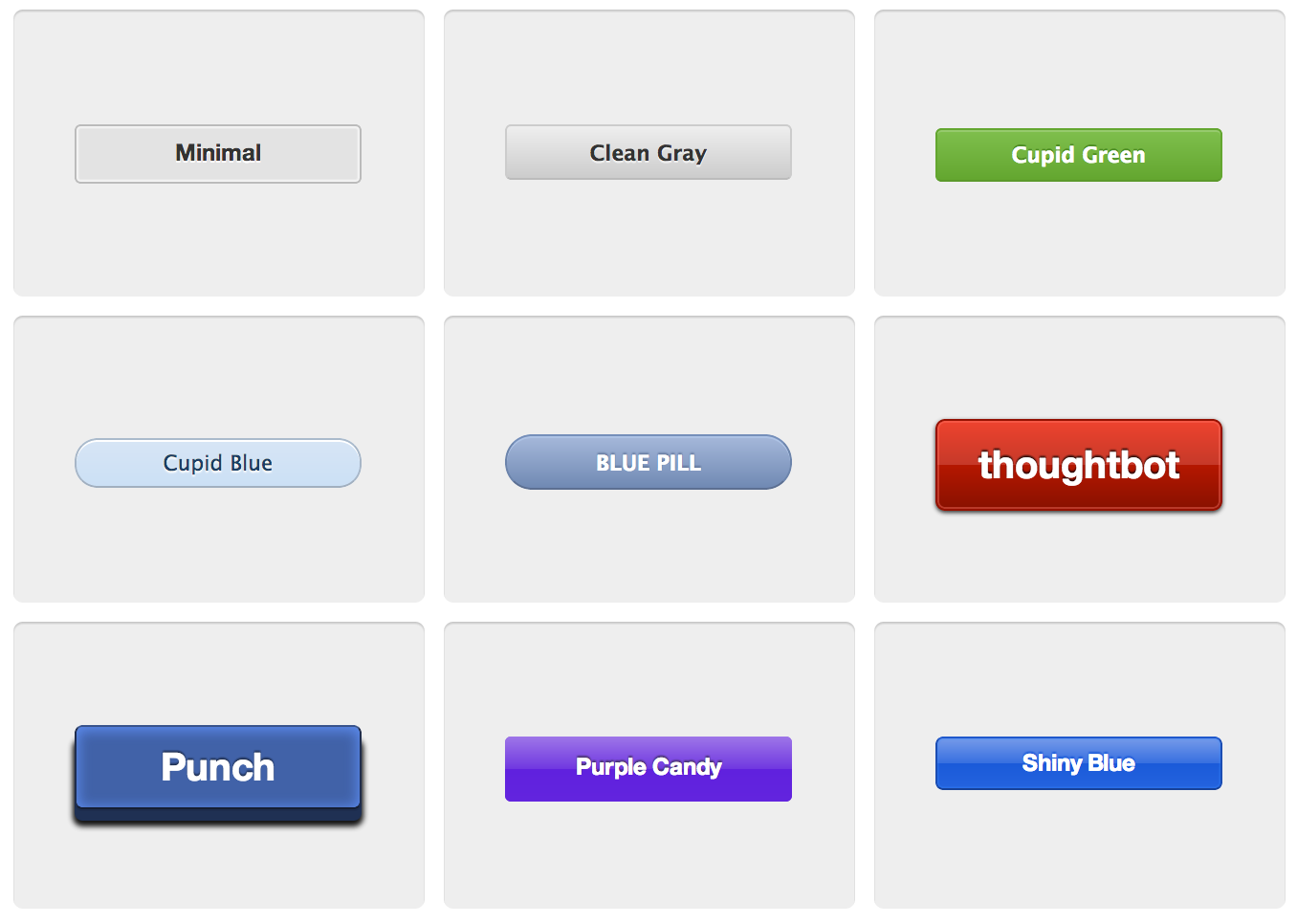
adds a drop shadow to an element
box-shadow: offset-x offset-y color
.example1 { box-shadow: 1px 1px red; }
box-shadow: offset-x offset-y blur spread color
.example1 { box-shadow: 0 0 1px 1px red; }
#example1 { text-shadow: 2px 2px 10px red; }

#example2 {
text-shadow: 1px 1px 10px red,
            10px 10px 10px orange,
            15px 15px 10px yellow,
            20px 20px 10px green,
            25px 25px 10px blue,
            30px 30px 10px purple;
}Build gradients with CSS
.linear-example1 {
background-image: linear-gradient(red, orange, yellow, green, blue, indigo, violet);
}
.linear-example2 {
background-image: linear-gradient(right, red, orange, yellow, green, blue, indigo, violet);
}
.linear-example3 {
background-image: linear-gradient(bottom right, red, orange, yellow, green, blue, indigo, violet);
}.linear-example4 {
background-image: linear-gradient(red, white);
}
.linear-example5 {
background-image: linear-gradient(right, red, white);
}
.linear-example6 {
background-image: linear-gradient(bottom right, red, white);
}.radial-example1 {
background-image: radial-gradient(circle cover, red, orange, yellow, green, blue, indigo, violet);
}
.radial-example2 {
background-image: radial-gradient(0 0, circle, red, orange, yellow, green, blue, indigo, violet);
}
.radial-example3 {
background-image: radial-gradient(0 50%, circle, red, orange, yellow, green, blue, indigo, violet);
}.radial-example4 {
background-image: radial-gradient(circle cover, red, white);
}
.radial-example5 {
background-image: radial-gradient(0 0, circle, red, white);
}
.radial-example6 {
background-image: radial-gradient(0 50%, circle, red, white);
}
CSS3 allows multiple background images
.example {
background-image: url('../images/html5-features.png'),
                url('../images/sky.jpg');
}Enhance our Women in Computing web site to use HTML5 & CSS3
Allow property changes in CSS values to occur smoothly over a specified duration
Create some awesome effects without any JavaScript
the names of CSS properties that should be transitioned
.example1 { transition-property: background-color; }
set to all to transition all CSS properties
.example2 { transition-property: all; }
the number of seconds or milliseconds a transition animation should take to complete
.example1 { transition-duration: 2s; }
delay transitions from the moment a trigger happens
.example1 { transition-delay: 0s; }
.example2 { transition-delay: 1s; }
.example3 { transition-delay: 2s; }
.example4 { transition-delay: 3s; }determines how intermediate values are calculated
.example { transition-timing-function: ease; }Allow elements rendered by CSS to be transformed in space
scales the element
transform: scale(sx[, sy]);
rotates the element degrees around its origin
transform: rotate(angle);
move element using x and y coordinates
transform: translate(ax[, ay]);
the x and y origin for transformation
transform-origin: x-offset y-offset;
animate transitions from one CSS style configuration to another
@-webkit-keyframes background-color{
  from { background-color: slategray }
  to { background-color: black }
}
#background-color {
  -webkit-animation: background-color 1s infinite alternate;
  background-color: slategray
}Enhance our Women in Computing web site to use HTML5 & CSS3